Redesign the Cover Experience
Rethinking the cover selection process to simplify workflows and empower users with smarter, faster decisions.
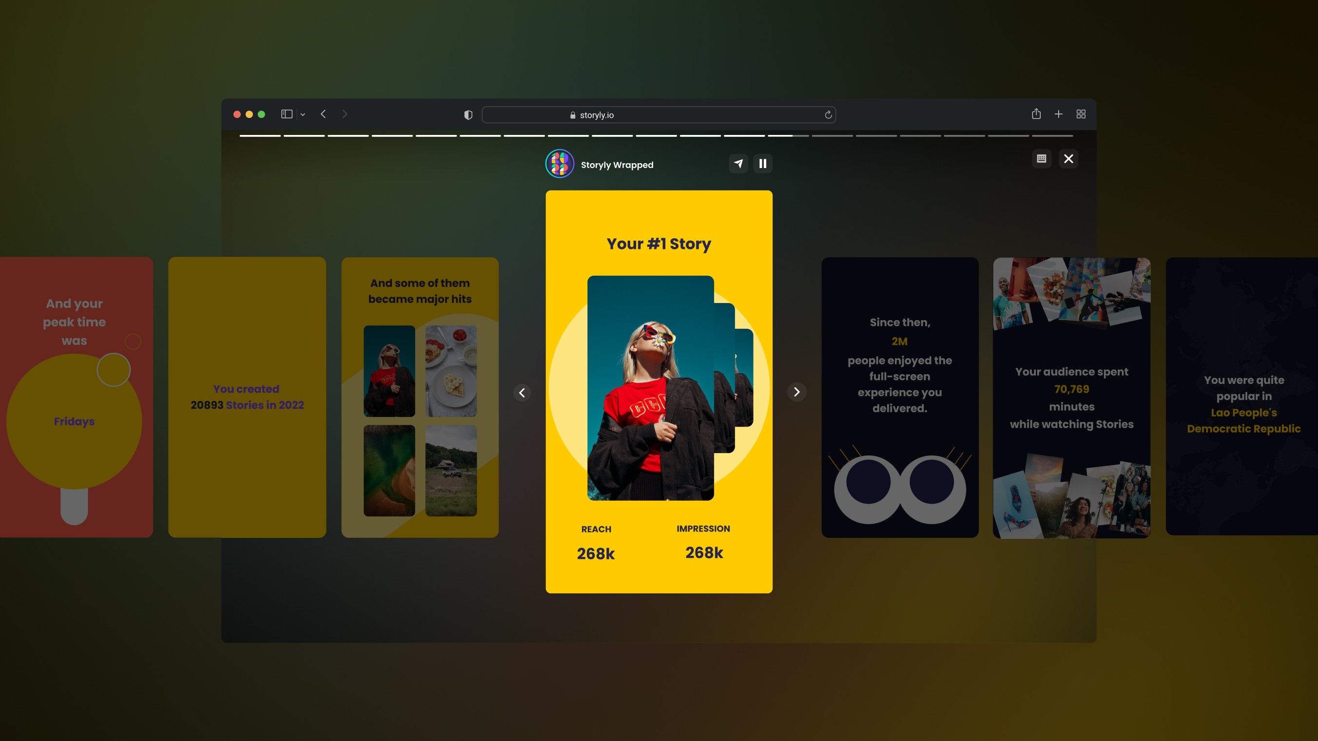
The Story Group Cover selection process in Storyly’s dashboard required a major redesign to address key user frustrations and streamline the workflow. Previously, users had to decide on a cover image before even creating their Stories, a cumbersome step that led to delays and confusion. Additionally, the lack of video support, adaptive layout adjustments, and manual-only cover uploads created further friction. To solve these problems, I redesigned the flow to prioritize user needs, introducing features like automatic cover selection, focal point adjustments, and video trimming support. This overhaul provided flexibility, saved time, and elevated the overall content creation experience.
The Challenge
The existing cover selection process presented significant barriers for our users. Storyly required users to upload a cover image before creating Stories, forcing decisions without visual context. If users didn’t have pre-prepared assets, this meant waiting for their design teams, delaying their work. Additionally, Storyly did not allow covers to be selected directly from existing Stories, nor did it support video-based covers—users were limited to static images or manually created GIFs.
Even when users uploaded a cover, it often struggled to adapt to various layouts or screen sizes, disrupting the visual flow in their apps. This inconsistency made the experience feel awkward and unrefined. It became evident that we needed to overhaul the cover workflow entirely, providing a solution that was intuitive, flexible, and scalable for future needs.
Design Process
The project began with extensive research to explore cover selection and thumbnail workflows across platforms. I looked beyond SaaS tools, analyzing video-centric apps like YouTube, Instagram Reels, and TikTok to understand how they handled content selection and publishing. Screenshots and user flow breakdowns were gathered in Figma, and I studied how these platforms positioned key actions like selecting, previewing, and trimming covers.

Armed with insights, I began reimagining the user journey for Story Group covers. I proposed a workflow shift: instead of starting with the cover, users would first create their Stories in the Studio and then select or edit their covers. To streamline this step further, I introduced an automatic cover selection—pre-filling the cover with one of the uploaded Stories, which users could later refine. This removed unnecessary friction and made the process feel more intuitive.

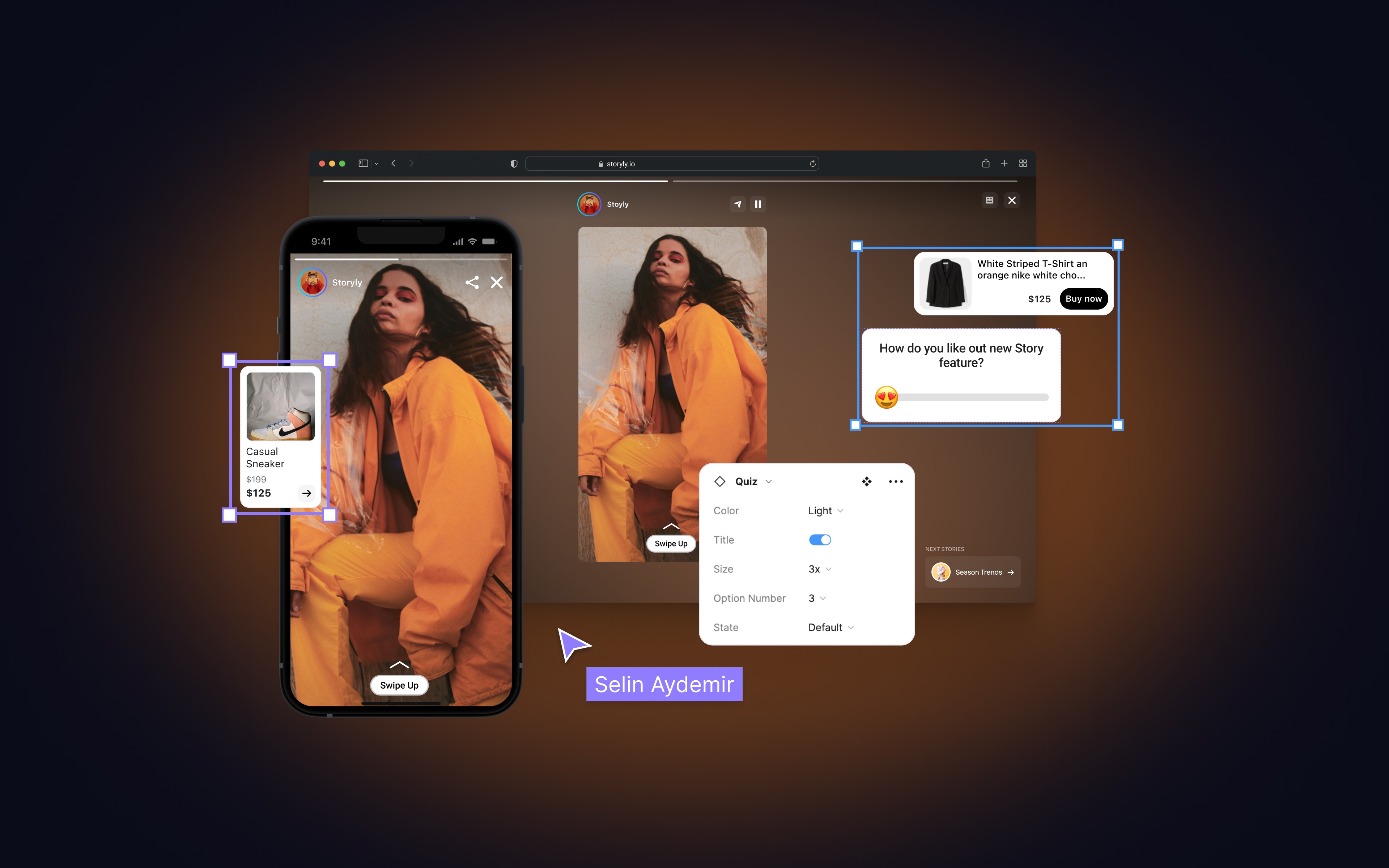
The next step was solving for adaptability. I implemented a focal point adjustment feature, a solution inspired by my research on platforms like Framer. Focal points allow users to define the most important area of an image, ensuring the cover always looks visually consistent across various layouts and screen sizes. This not only solved the existing layout issues but also provided a foundation for future features like Smart Cover recommendations.
With the image-based covers resolved, I turned to video. I designed a video trimming interface that allows users to select specific segments of uploaded videos for their covers. Since our condition required video covers to be capped at 7 seconds, I researched various platforms, such as YouTube and Instagram, to explore how they implement video trimming interfaces. This analysis helped me design a simple yet effective timeline feature that allows users to easily select specific segments of their uploaded videos for covers while adhering to the 7-second limit. The result ensured optimal usability, performance, and engagement.


Throughout the process, I collaborated closely with the product team to validate the design decisions. Multiple concept iterations were tested internally, ensuring the new workflow was both intuitive and technically feasible.
Outcome & Impact
The redesigned Story Group Cover experience delivered a flexible and user-friendly solution that addressed all the identified challenges. Users now create Stories first, allowing them to visualize their content before deciding on the cover. The introduction of automatic cover selection and the ability to edit covers directly from existing Stories significantly reduced friction and saved time.
The impact was clear. Feedback gathered from users and behavioral insights observed through FullStory showed that the new workflow was quicker, smarter, and aligned with user expectations. The redesigned flow not only improved the user experience but also brought a cleaner, more polished UI—elevating the overall quality of the dashboard experience. Setting the stage for future enhancements like Smart Cover recommendations powered by engagement metrics.